Michael Beveridge
Safeco Book Transfer Portal
The goal of this assignment was to streamline and simplify bulk policy transfers for Safeco independent agents. I led the design team which also included two researchers, a content strategist and support from our design system team. I also worked closely with our product owner and developers as well as with the Book Transfer strategy team.
Design Challenge
The primary design challenge was to merge content and actions from two legacy applications into a one-screen workflow. Specifically, I needed to improve overall data display and related actions, content categorization and workflows, and introduce a new side panel with supporting features.
User Testing
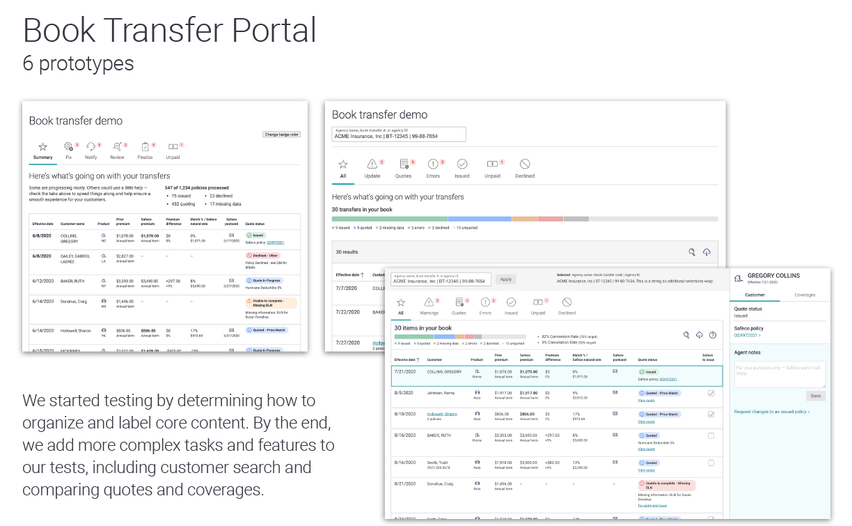
Working with research partners, I built and tested 6 HTML prototypes over an 8 week period. I focused first on moving our core tools from a two-page design to a single screen, then introduced cleaner tables and finally looked at our content categories and how they mapped to agent workflows. In later sessions, I introduced new features like the side panel and worked with our content strategist on updating our calls to actions to reduce points of confusion.
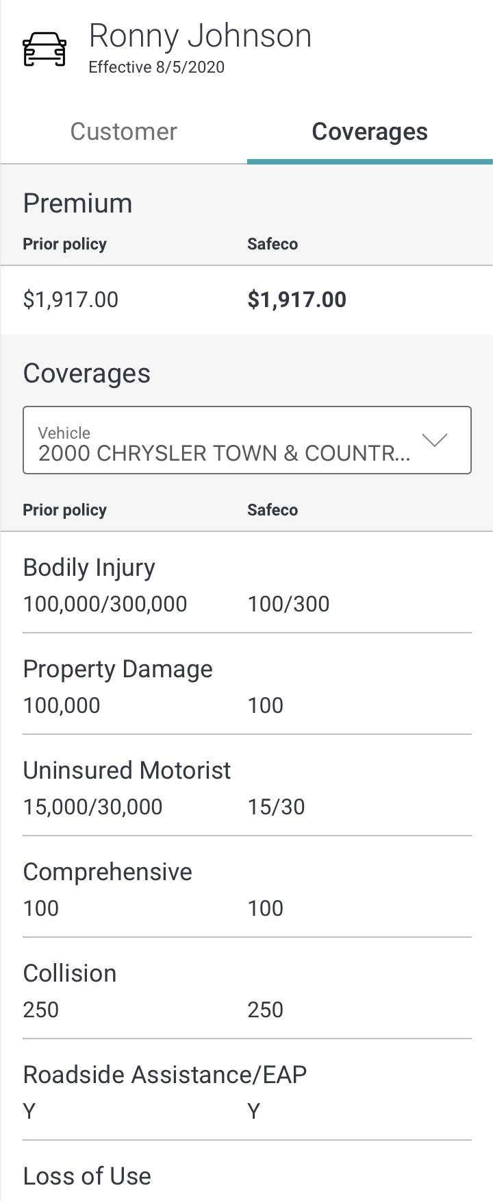
22 agents participated in moderated, one-on-one studies using clickable prototypes, testing over 30 hypotheses. Rapid iteration informed many of the design updates above. Overall, we saw a very positive responses to data display and organization, visual design, and navigation. Agents loved having a coverage comparison view in the Book Transfer Portal.
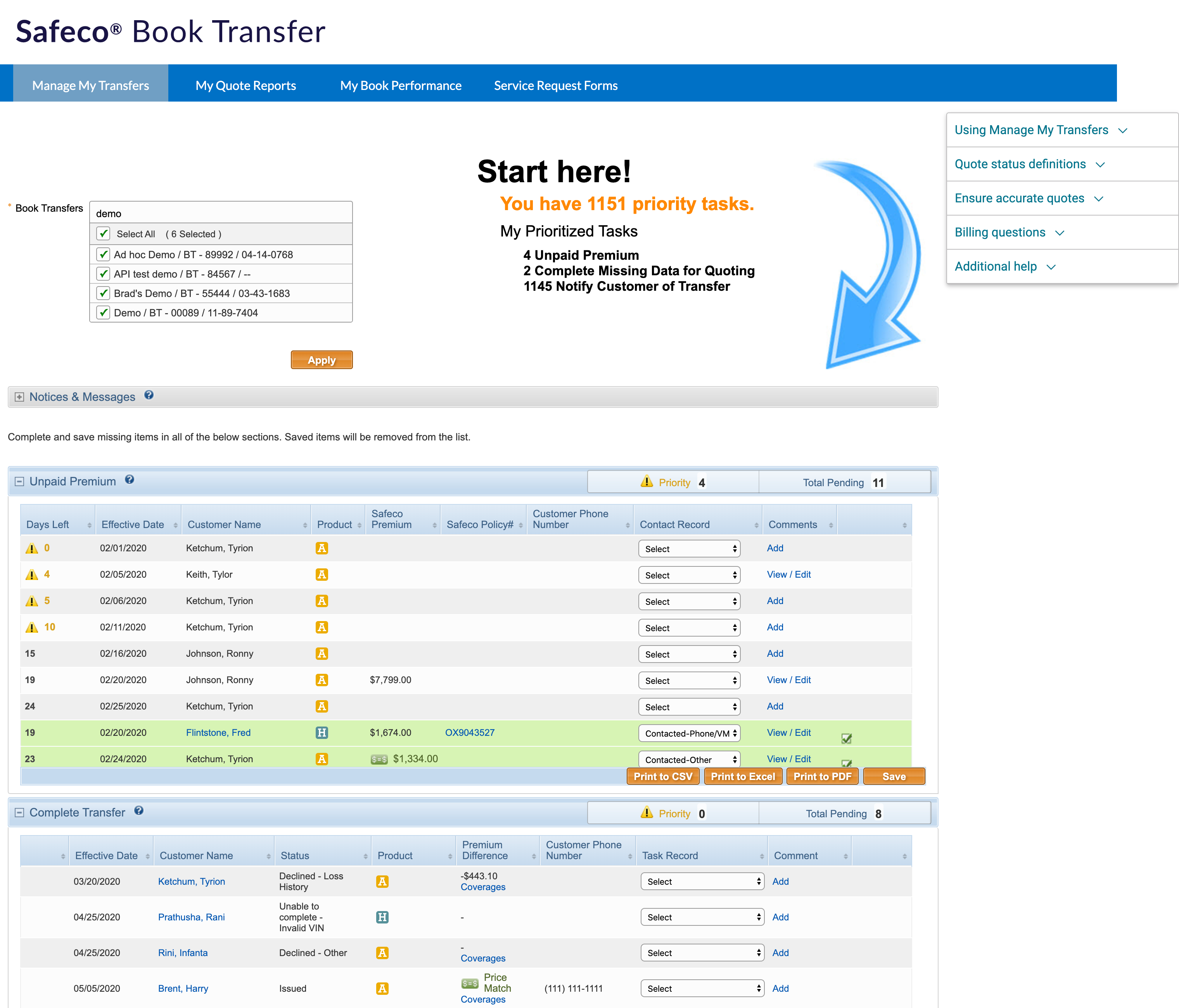
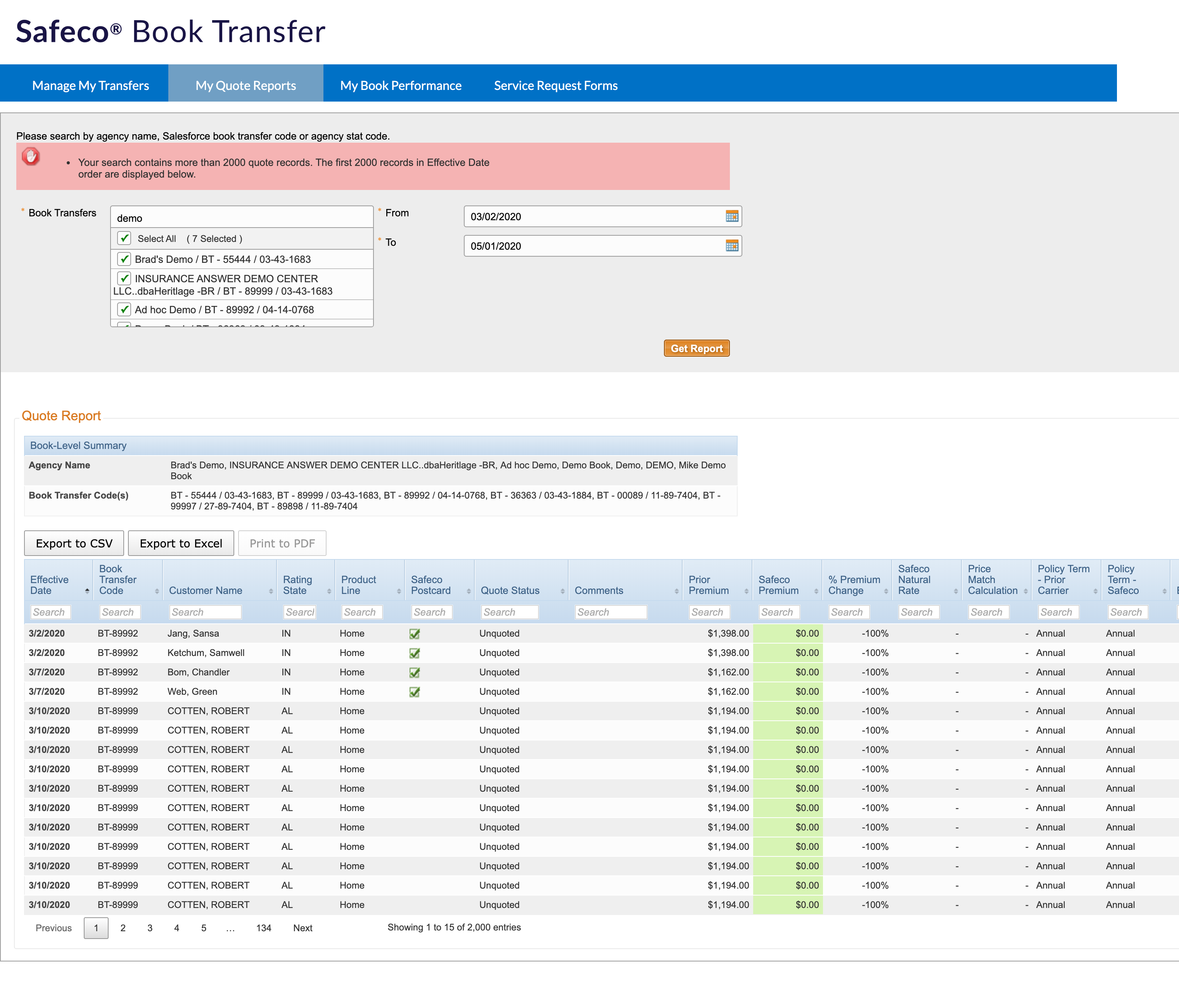
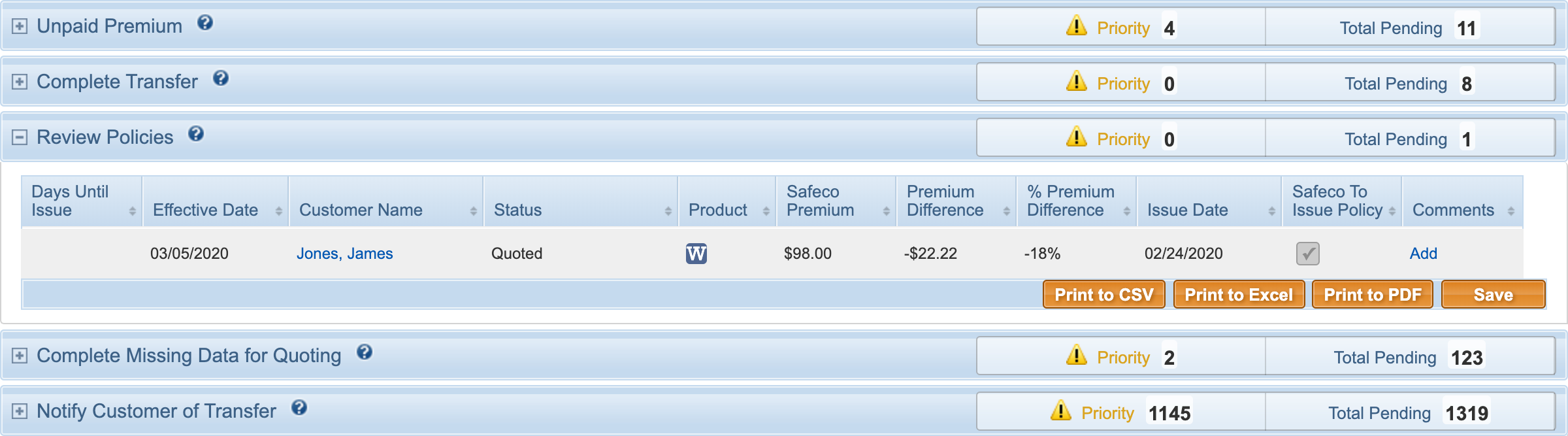
Tabular Data - Before & After
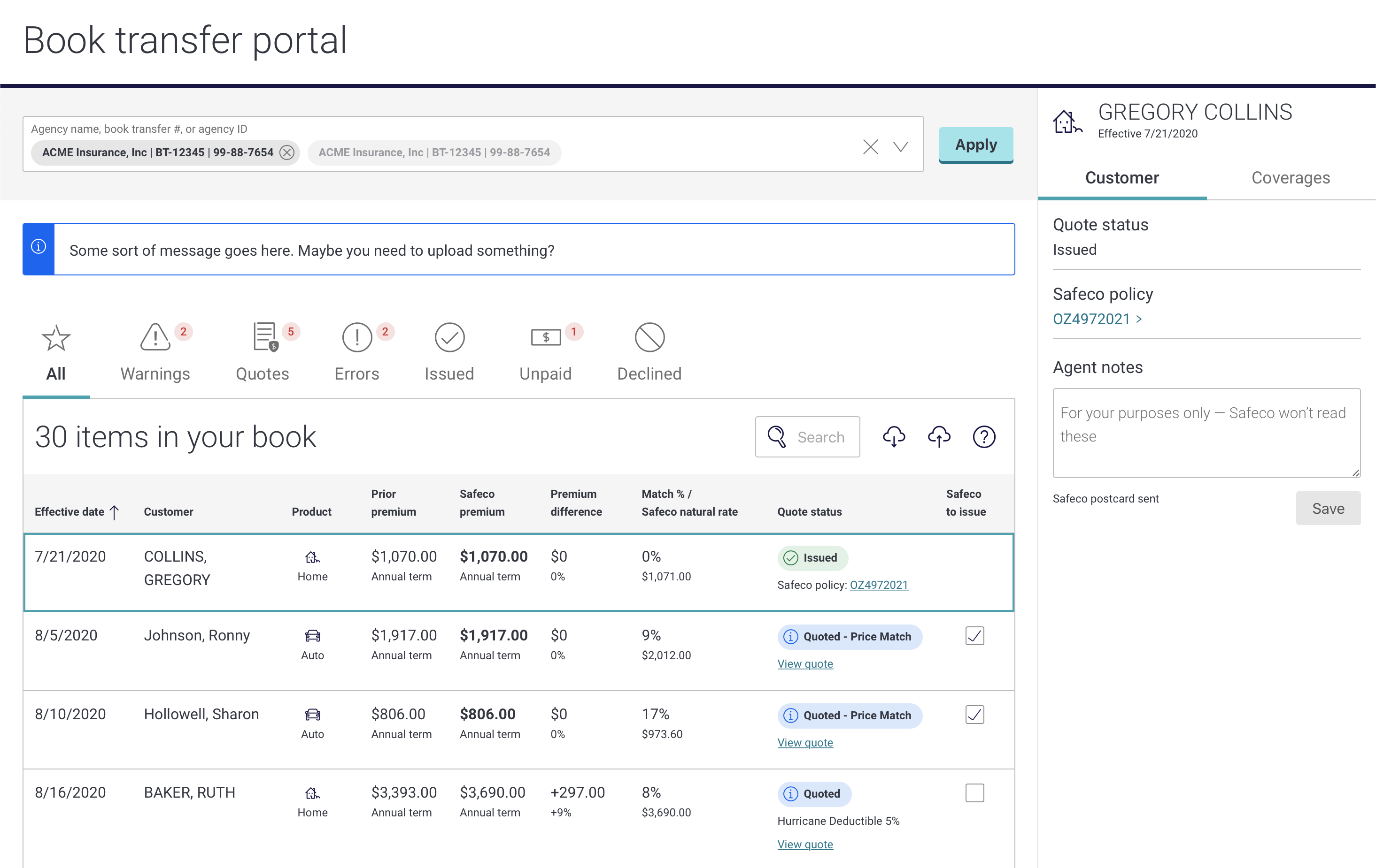
Bulk import of insurance policies generate a lot of data. Policy effective dates drive both manual and automated decisions which trigger status changes throughout the life-cycle of a transfer. It's often important for agents to take action at certain points in the book transfer process, so my first task was rethinking the overall data display, group related content and offer contextual feedback and actions.The result was a unified display pattern that accommodated the full range of data related to a policy transfer.

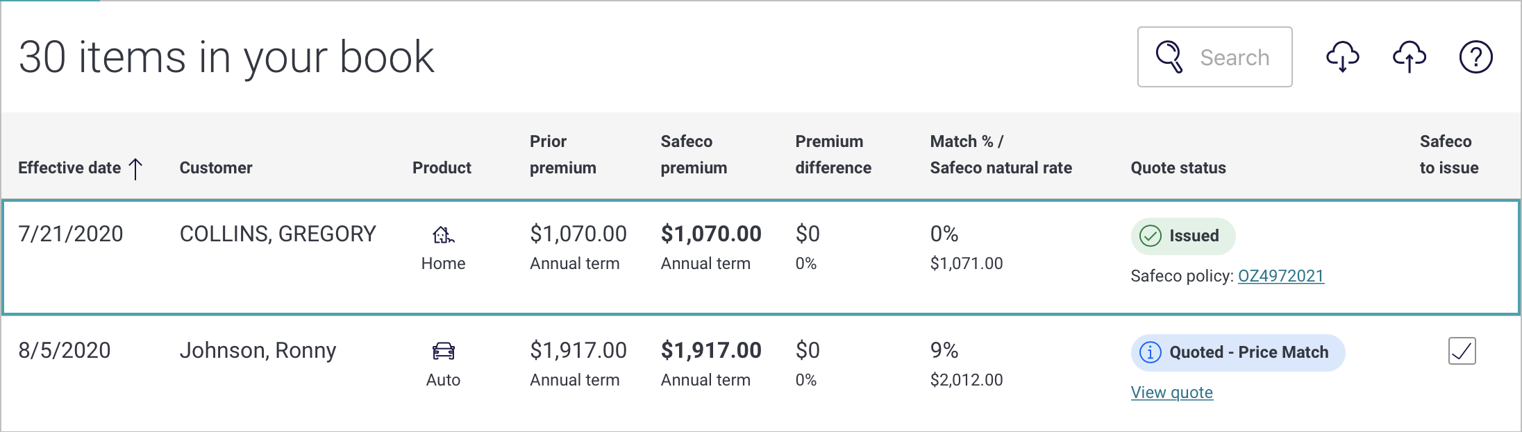
Content Categorization - Before & After
Merging legacy task list and quote report screens required me to rethink overall content grouping and actions related to various categories. My first step was to move away from a stacked-list approach and to filtered views, represented as tabs. I added simple notification badges to indicate policies that might need attention. I also incorporated agent feedback to determine the logical order of sections, section labels and content, and whether legacy categories should be kept, updated or removed.

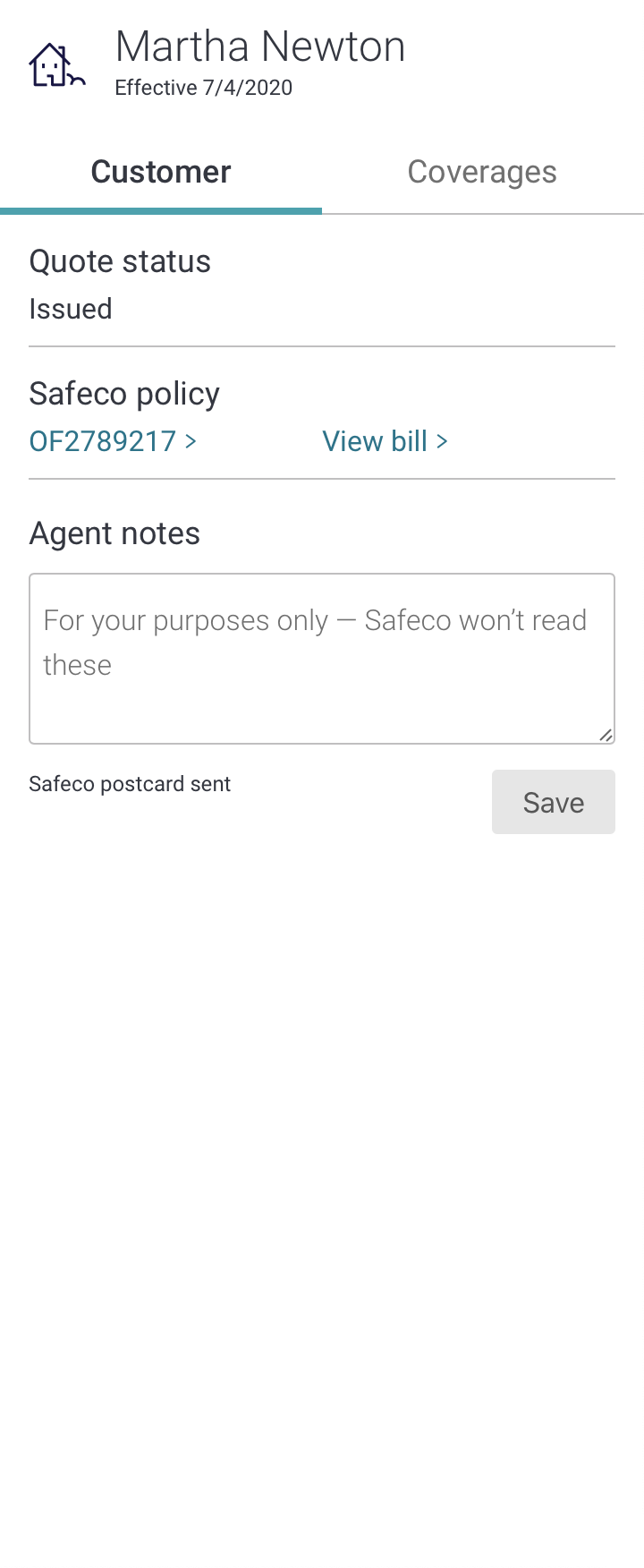
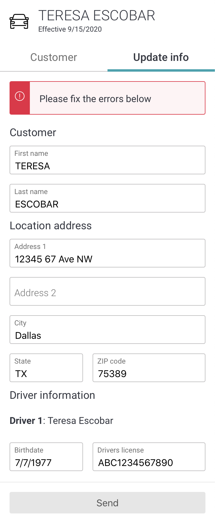
Side Panel
Perhaps the biggest change to the Book Transfer Portal was the addition of a persistent, right panel. I've used mobile patterns for desktop applications in the past and like using the right side of the screen for supporting features. Below you see how this approach allows for a lot of flexibility and contextualization. The first panel is a light, customer information panel. The second example shows a form field agents might use to update missing information. The last example is a more robust, Coverage Compare feature, showing policy details from the prior carrier and Safeco quote.
MVP Design & Demo
Book Transfer Portal development started September 2020 and MVP is expected to ship Q1, 2021. I created all of my prototypes in HTML/CSS so hand-off to engineering is very straight forward. I've included a link to the full protoytpe below.
Book Transfer Portal MVP Demo
Outcome
Although the Book Tranfer Portal is still in development, we gathered quite a bit of qualitative data over the summer. Agents rated the new portal an average 6.5 out of 7 which was ‘Very Easy’ to use. Overall, 95% of agents preferred the new portal experience.